


Project Name: (Un)Common Objects
The Ask/The Challenge/Project Statement
The challenge was to create two typographical pieces using ink marks, which could utilize any material.
Target/Intended Audience
The audience at the beginning was my professor and my peers, as those are who would see it in critique and in the hallways if we could present and display them.
Research
For research, I tried out many different objects to achieve different marks. I tried marbles, pieces of tinker toys, game pieces, leaves, sponges, sticks, crumpled napkins, yarn, and more. I then made pages and pages of marks using these items to achieve different effects. The second part of the research process was trying to find words that fit the marks and the vibe that they gave off. I spent time online making lists of words and then searching for similar words or associations that went along with them to achieve the desired effect. I chose fragile for my napkin marks first, but after some discussion and critique with my peers, I found the word Fracture to fit it more strongly. I then chose to pair the yarn marks with the word parasite, since it fit the gross, wriggling nature of the marks.
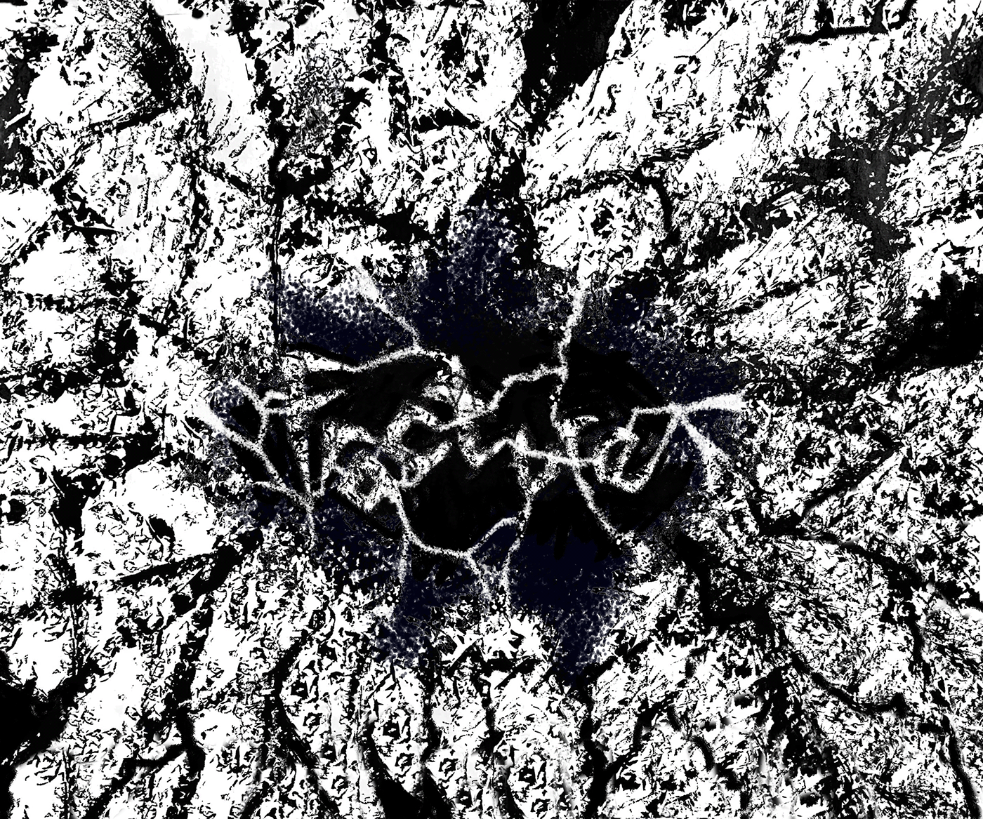
Design Process
The first step was experimentation. I began to do so by making all kinds of marks with different objects, and putting them up for critique with a list of words that I felt might suit them. After receiving feedback on them, I narrowed down two marks and reworked the words that went with them as well. The marks I chose were my napkin and yarn marks, and I chose the words fracture and parasite to go along with them. I chose fracture because the crumpled napkin made sharp crack-like marks that reminded me of shattering glass. I first chose fragile for my word, but after critique I was advised to try shatter or fracture, which suited the design better. I chose parasite because the yarn marks reminded me of little worms and that led me to the idea of parasitic worms. I then made layouts for how I thought I could arrange my marks and put them up for critique. For fracture, I had a more blotchy approach at the beginning, but it was suggested I try to make the background look like shattering glass, so I changed the design to suit that. For parasite I had the little worms form the word, and others suggested I add more worms and little trails to follow them through the design. I made these changes and shared my images again, and was told that for my shattering glass effect I should thicken the small lines in the center. I did so but didn’t enlarge them to the full size of the ones surrounding it, because they then became too large for the small letterforms in the center. I then organized my files and uploaded them.
Design Solution
My final design for fracture changed over a couple critiques. At first I wanted a more blotchy look but the suggestion for a shattering glass effect worked better with my word. I wanted the design to be central to the page, because it worked with the broken glass theme, and that kept the audience’s focus. I also made things a little distorted both to fit the theme and make the words look more in tune with its surroundings. I put the letters sharp and off kilter because that worked with the vibe both the mark and the word gave off: sharp, dangerous, and broken. For parasite, I made the word central as well to make it a little easier to read. I included more trails and little parasites to set a background that was fluid with how the word flowed through it, and it created a more complicated composition. The final composition of fracture is sharp and has a dangerous and broken feeling to it, much like the word I began with and the little marks I first made, carrying the theme through. The final composition of parasite is full and has a lot of movement in it, which fits with the wriggling nature of parasitic worms, making the word work well with the final layout. I changed the designs over time to make it easier to read in some places, and harder in others to make it work with its surroundings so the audience could look at the whole first and then the word.

